
 RIAI registered
Lead designer & founder
Get in touch
Sarah O'Brien
View profile
Founded the studio in 2014 after a decade in larger Dublin practices; on site for every critical build moment.
Appearance
The people behind the work — led by their qualifications, not by a row of smiling avatars.
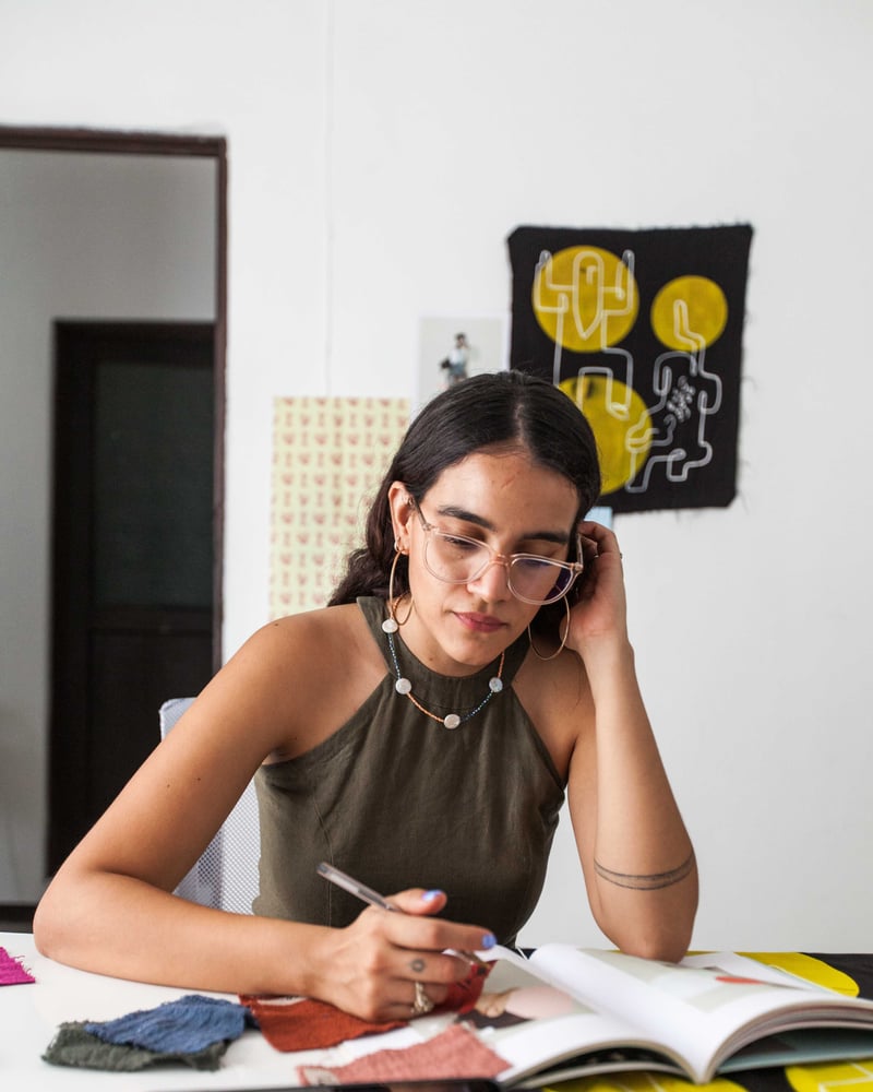
Each person gets an editorial portrait with their professional credential sitting on the photo, their role above their name, and — behind a View profile disclosure on the name row — a couple of lines about what they actually do. It's the section that turns "a company" into "these specific, qualified people".
Short kicker text rendered above the heading in smaller, uppercase type.
Irish design, family-run
Every project is led by a named project manager and finished to BIID standards.
RIAI registeredFounded the studio in 2014 after a decade in larger Dublin practices; on site for every critical build moment.
 BIID
BIIDLeads concept development and the three-directions presentation at the heart of stage two.
 CIOB · PMP
Holds the programme, the budget ledger and the variation register on every full-management build.
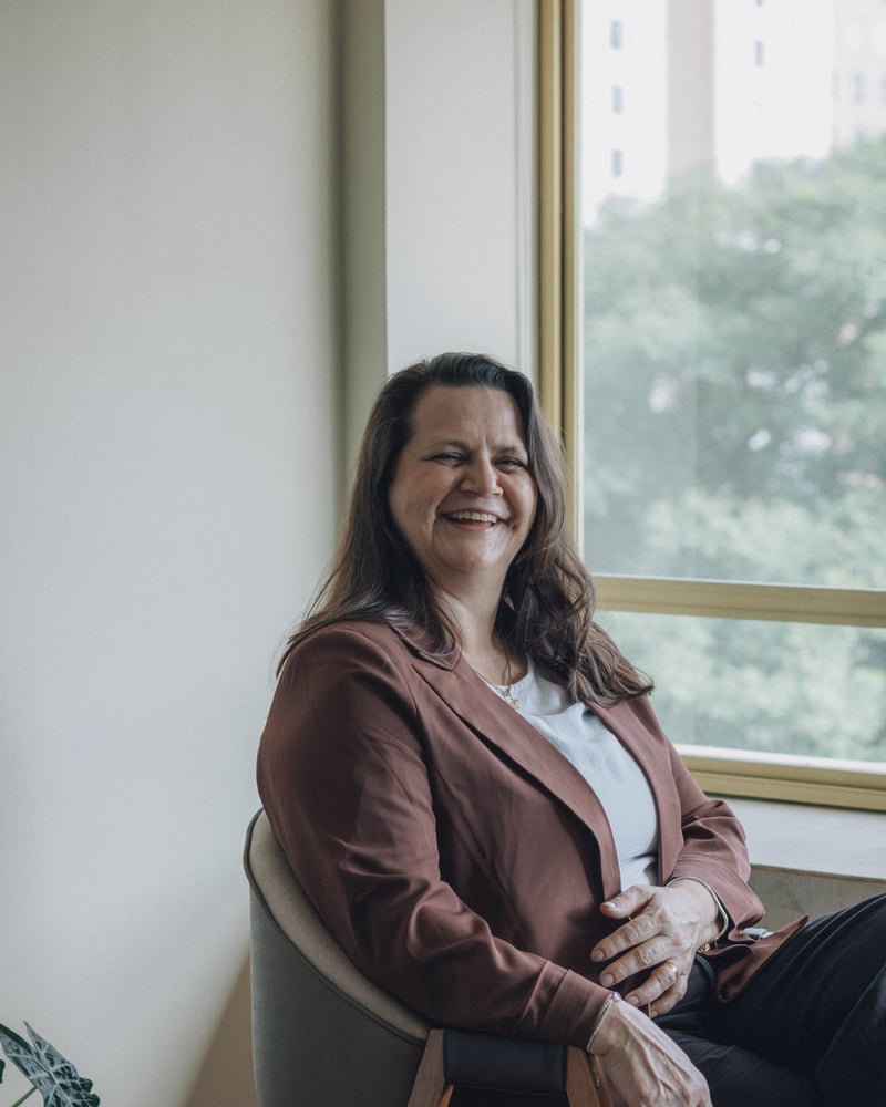
Your first reply within one working day; keeps every engagement's written record straight.
Open View profile on a card to reveal its bio, then edit the first member's Credentials — it's the chip on the photo. Type a long one and watch it wrap rather than disappear.
Each person is a team member block: a name, a role, a credential, a short bio, a portrait, and optionally a link. Up to eight people. Every field is optional, and the card drops whatever you leave out rather than reserving space for it — a member with no credential simply has no chip, and a member with neither a bio nor a link has no View profile disclosure at all, just their name over the hairline. (A block with every field blank renders an empty cell, so delete it rather than leaving it.)
Profile link is where the disclosure's closing link points. It reads Get in touch on the storefront, not "read the full profile" — most shops have no per-person profile page, and the link would over-promise one. Point it at your contact page (or that person's own page, if they really have one).
Portraits are cropped to a 4:5 upright frame, with corners following your theme's card corner radius — the Uisce preset squares them off. Upload something close to that shape: a wide landscape photo will be cropped hard to fit, and the crop takes the middle, so a face near the edge can be cut.
There's no "no photo" fallback beyond text — a card without an image is just words, so a bench where some people have photos and some don't will look uneven. Either photograph everyone, or no one.
Credentials is the small chip that sits on the bottom corner of the photo — RIAI registered, BIID, CIOB · PMP. It's the whole point of the section, so keep it to what it is: a qualification, not a sentence.
A credential wider than the photo is trimmed to fit with an ellipsis on most presets (on Uisce it wraps onto a second line instead) — so keep the chip to the qualification itself and put the detail in the bio.
Desktop (4 columns)                        Phone
┌──────┐ ┌──────┐ ┌──────┐ ┌──────┐        ┌────────────┐
│photo │ │photo │ │photo │ │photo │        │   photo    │
│[chip]│ │[chip]│ │[chip]│ │      │        │   [chip]   │
└──────┘ └──────┘ └──────┘ └──────┘        └────────────┘
ROLE     ROLE     ROLE     ROLE            ROLE
Name ▾   Name ▾   Name ▾   Name ▾          Name ▾
──────   ──────   ──────   ──────          ────────────
bio — shown when View profile is open
Columns sets how many people sit side by side on a desktop (2, 3, or 4) — that is the number you get, not a maximum. Fewer people than columns is fine: they spread to fill the row rather than leaving a gap on the end. Narrower screens step the row down on their own once the cards would get too tight, and on a phone they stack one per screen; on the Uisce preset the portrait is capped there too, so the name and role stay in view without scrolling the card.
Above the grid, Eyebrow, Heading and Text compose one centred intro block on a narrow measure. Leave all three blank and it disappears entirely.
| Setting | What it does |
|---|---|
| Eyebrow | A short kicker line above the heading. Optional. |
| Heading | The title above the team. Optional. |
| Text | An intro paragraph under the heading. Optional. |
| Columns | 2, 3, or 4 people side by side on a desktop. |
| Color scheme | Which of your theme's colour schemes the whole section uses. |
Per member: Name, Role, Credentials, Bio, Image, and a Profile link.
Two or three lines. Say what this person is responsible for on a job — "Holds the programme, the budget ledger and the variation register" tells a client far more than "passionate about design". Each bio sits behind its card's View profile disclosure, so the bench stays compact until someone asks. Each card opens on its own and stays open — opening a second does not close the first.
The portrait's alt text comes from the alt text set on the image itself in your Shopify admin — give each portrait a short description there (the person's name works well). The credential chip is real text, read in the card's normal order, so a screen-reader user gets the qualification even though it's positioned over the photograph — it's never baked into the image.
The chip keeps its own solid backing rather than relying on the photo behind it, so the label stays readable whatever you upload, in light mode and dark.
All of the text — the role, the credential, the name, the bio, the disclosure label and its link — is inked with your colour scheme's text colour, so it stays legible on every scheme you can pick, not just the one shipped with the preset. Your accent colour does the decorating instead: the rule beside the role, the chip's edge, the chevron, the hairline under each name and the underline on the link. The link is underlined at rest for the same reason — colour on its own is never the only thing marking it.