
Appearance
Image with text
Pair a photo with words — a brand story, a feature callout, a product spotlight. Add a heading and some text, drop in an image, choose which side the image sits on, and add a button so shoppers can act on it. On the Uisce preset the band becomes an editorial story panel — a sea-glass eyebrow, a luminous waterline seam under the title, and a frosted sea-glass button over a photo-led spread; the other presets keep a clean, classic side-by-side.
Try it
Edit the settings and switch presets — the preview is the real band with the shipped theme CSS, so what you see is what your store renders.
←Image with text
Small label above the heading. Leave blank to hide.
Optional line below the heading. Leave blank to hide.
Leave empty to hide the button.
A second, understated link. Leave blank to hide.
Which side the image sits on (desktop).
Storefront preview
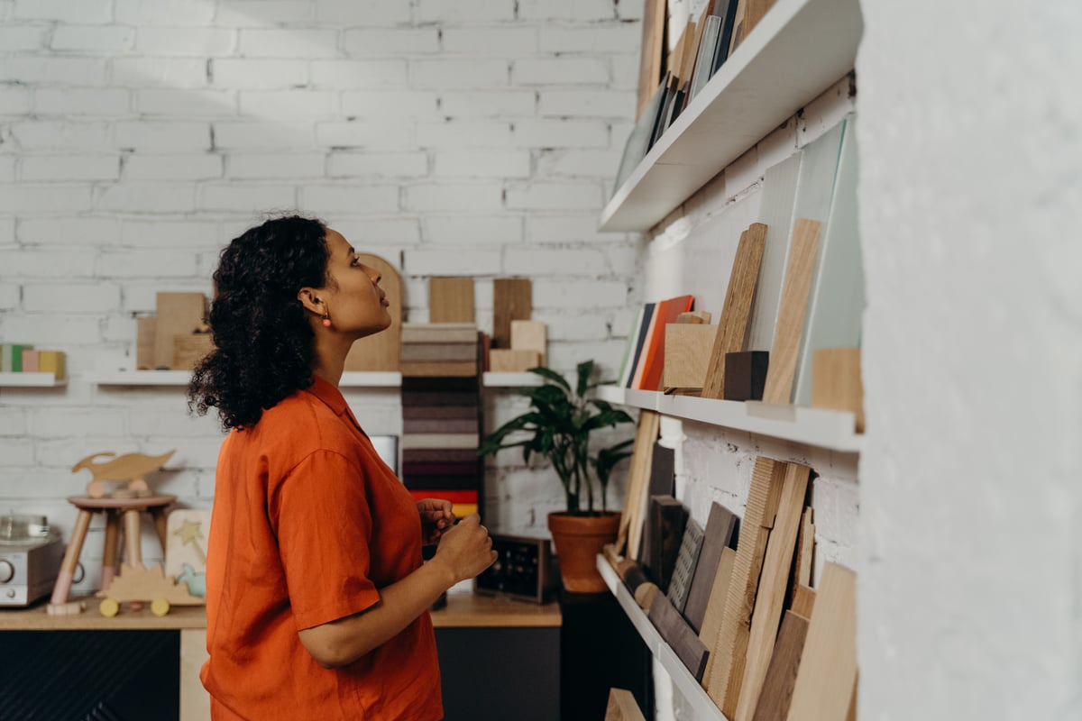
Our studio
Twenty Years of Irish Craftsmanship
Design carved from a quiet coastal legacy.
A family-run design practice rooted in Galway, serving homeowners across the west of Ireland with considered, site-specific design.
Settings
| Setting | What it does |
|---|---|
| Color scheme | The set of colours used for this band. One scheme paints the whole band (background + text), so it stays legible in light and dark. |
| Section width | Whether the band spans the full page width or is contained within the content column — contained or full. |
| Image | The featured photo shown alongside your text. |
| Image position | Which side the image sits on — left or right. Alternate it down the page for an editorial zigzag. |
| Image width | How much of the band the image takes on desktop — small (a third), medium, or large (two thirds). Medium is an even split in most presets; Uisce keeps its signature wider-photo split. Side-by-side layout only. |
| Image aspect ratio | The crop shape of the image — auto (natural), square, portrait, landscape, or wide. |
| Image position on mobile | On mobile, whether the image appears above or below the text. |
| Eyebrow | A small label above the heading (a category name or short kicker). On Uisce it renders as the sea-glass eyebrow. Leave blank to hide. |
| Heading | The title beside the image. On Uisce it carries the luminous waterline seam. |
| Heading size | The size of the heading text — small, medium, large, or extra large. |
| Subheading | A secondary line below the heading. On Uisce it renders as an editorial italic lede. Leave blank to hide. |
| Text | Supporting copy under the heading — supports bold, links, and lists. |
| Button label | What the button says. On Uisce it’s a frosted sea-glass pill; elsewhere a standard button. Leave empty to hide it. |
| Button link | Where the button takes people when clicked. |
| Secondary button label | An understated second link beside the button. On Uisce it’s a ghost text link with a trailing arrow. Leave blank to hide. |
| Secondary button link | Where the second link goes. |
| Layout | How the image and content are arranged — side by side, stacked (content below image), or overlap (content over the image). |
| Vertical alignment | Lines the text up with the top, centre, or bottom of the image. |
Image sizes
The image is requested at up to 3840px wide — twice the 1920px maximum panel — so upload at least 1920px.
Image aspect ratio decides the shape. Auto keeps the image's own, and Square, Portrait, Landscape and Wide crop it to fill that box, so keep the subject centred if you pick one. Image width decides how much of the row the panel takes.
Blocks
- Quote — a pull-quote for a testimonial or highlighted statement, with an optional citation.
- Custom Liquid — raw Liquid rendered below the text, for advanced merchants.
- App block — add blocks from installed Shopify apps.
Layout
- Side-by-side, image left or right. The photo and copy sit beside each other on desktop and landscape tablets — narrower screens stack them; the image side is yours to choose. Alternate left / right when you stack more than one band so the page reads as an editorial zigzag.
- Stacks on mobile. On phones the image and copy stack; the Image position on mobile setting picks which goes on top.
- Uisce editorial story panel. On the Uisce preset only, the band becomes an asymmetric photo-led spread: the eyebrow becomes a sea-glass kicker, the heading carries the luminous waterline seam, the subheading becomes an italic lede, the button becomes a frosted sea-glass pill with a ghost secondary link, and a waterline seam marks the photo↔copy boundary. The copy sits in a contained, scheme-derived panel that fills its track — no dead gutter. It’s a preset skin over the same markup, so the other four presets render the clean base band.
Accessibility & internationalisation
- The heading is a single
<h2>; the eyebrow and subheading are plain paragraphs, so there is no heading-order break. - The button is a real link with a discernible name and a ≥ 44×44 tap target; keyboard focus is visible.
- One colour scheme per band keeps text at WCAG AA contrast in both light and dark — the Uisce accents derive from the scheme, so they hold on light and dark schemes alike.
- The eyebrow, heading, image side, and buttons mirror correctly for right-to-left languages, and every label is translated across all supported locales.
When it isn't showing
The section always renders, and ships with default copy, so an untouched one shows placeholder text rather than nothing. Replace the Heading and Text, and add an Image — with no image the panel lays out as text alone.
Tips
- Alternate the image side when stacking multiple bands — image left, then image right — for a zigzag that keeps the eye moving.
- Use the text field for a short bullet list when highlighting a few features or benefits; it supports full formatting.
- Add an eyebrow + subheading on Uisce to turn a plain split into an editorial story panel — e.g. eyebrow “Our studio”, subheading “Design carved from a quiet coastal legacy.”