
Appearance
Collection experience
How your store looks when shoppers browse — the product cards, the collection page that frames them, and the all-collections landing page. On the Uisce preset these three surfaces share one coastal-editorial look so the whole browse journey feels like a single, designed system.
- Editorial product cards — each card is a calm "service tile": a project photo, a luminous waterline seam under it, frosted status badges, a clear title and price, and a quiet metadata capsule for a key detail (turnaround, lead time, area).
- A framed collection page — the product grid sits inside a tidy frame: a clean heading, filter chips to jump between sub-collections, an elegant filter rail, and a sort bar — so the page never looks like a bare wall of products.
- A mosaic landing page — your
/collectionspage lays the collections out as an editorial mosaic that always fills the space with no empty gap, however many collections you have.
It's the browse experience for any store selling considered purchases — home services, design, renovation, studios, clinics — where each listing deserves room to breathe.

Try it
Pick a preset above the preview to see that niche's real collection style — its sub-collection chips, its divider, its filter rail, its mosaic seams, and its product card all switch to that preset's shipped signature over the same shared markup (Tine's forge heat-glow, Talamh's soil-strata, Gaoth's warm wind-trail, Uisce's coastal waterline, Neart's calm vital-pulse). Drag the Collections shown slider to watch the mosaic re-balance (it never leaves an empty row), toggle the capsule icon, and use the screen-size and light/dark buttons in the preview header to check a phone and dark mode.
←Collection experience
5
How many collections are on the /collections page. Watch the mosaic re-balance — it always fills with no empty row.
Show a small leading icon on the product card's niche capsule.
Pick a preset above the preview to see each niche's real collection style — the chips, the divider, the filter rail, the mosaic seams, and the product card all switch to that preset's shipped signature.
Storefront preview
Power tools
Every cordless and mains-powered tool in the range — every spec on the label.
48 products
Power Tools

Hand Tools
Built for the trade
Collections
Browse the full range by job — power tools, hand tools, fixings, and safety kit.
The product card
Every grid — your collection pages, the featured-collection section, search results, recommendations — renders the same product card, so a change here shows up everywhere. On the Uisce preset the card is an editorial service tile:
- A project photo with rounded top corners.
- The signature waterline seam at the boundary between the photo and the details — a thin luminous line that fades from sea-glass green into glass-blue with a soft glow. It's the same seam used across the Uisce collection experience, so the cards, the landing page, and the framing all share one thread.
- Frosted glass status badges top-left (e.g. "Sold out") — translucent mist with a sea-glass hairline, not a loud retail tag. Sale and stock badges keep their bold colour so a promotion still stands out.
- A frosted circular quick-view affordance top-right.
- A category eyebrow in sea-glass above the title, the title and price in the theme's own heading font (so the card stays in step with the rest of your store), and a quiet metadata capsule under the price showing one key detail.
The metadata capsule — now merchant-controlled
The capsule is a quiet caption-style line under the price. It reads a value from each product (a turnaround time, a lead time, an area served) and shows it as Label · value — e.g. "Turnaround · 8 hrs". Two things make it tidy:
- It hides itself when a product has no value, so you never see a stray "0" or an empty pill.
- A duration in minutes is shown in hours when it divides cleanly (480 minutes reads as "8 hrs").
You control two parts of it from the collection and featured-collection section settings:
- Capsule label — the prefix before the value (e.g. "Turnaround", "Lead time", "Serves"). Leave it blank to use the preset default.
- Capsule icon — a small leading icon, chosen from the theme's visual icon picker (the same full icon library used across the theme — a clock by default). It's a real picker, not a typed-in name, so you can't mistype it.
The collection page frame
The collection (product-listing) page wraps the cards in a considered frame instead of bare Shopify chrome:
- A clean heading and description in the theme's heading font.
- A row of sub-collection chips — frosted glass pills that jump between related collections (e.g. Kitchens / Bathrooms / Whole-home). The chip for the collection you're on fills with sea-glass so you always know where you are.
- An editorial filter rail — uppercase group headings, sea-glass checkboxes, and a sea-glass price slider — so filtering feels part of the brand.
- A sort bar with a frosted dropdown, and an optional grid/list view toggle — the toggle is off by default; switch it on in the section settings.
Two filter settings, now typed and foolproof
Two collection settings that used to be single comma-separated text fields are now proper building blocks you add from the editor, one block per filter or chip:
- Featured filter — pull a filter (e.g. Service type, Duration) to the front of the filter rail. Add one block per filter.
- Sub-collection chip — a chip with a Label and an internal Link. Add one block per chip. Links are checked to be internal, so a chip can't point off-site.
You can also set Columns on mobile (1 or 2) per collection — the Uisce demo uses a single column on phones for a calm, full-width browse.
When a filter combination matches nothing
Filtering to zero results shows a finished empty state, not a blank grid — and it's distinct from a collection that's genuinely empty:
- Filtered to zero — a clear heading ("No products match your filters"), a one-line suggestion, and a Clear all filters button — the theme's own button style, so it matches every other button in your store — that restores the full collection in one tap.
- Truly empty — a calm "check back soon" message with no button, so a collection you're still stocking never looks broken.
You can also offer a way onward: add a uisce.suggested_collections metafield to a collection (a list of collection references, or a JSON list of {label, url} pairs) and the filtered-to-zero state shows up to three "Or browse these collections" links as quiet buttons. Links are checked to be internal, and they follow the shopper's language.
The /collections mosaic landing
Your all-collections page (/collections) is an editorial mosaic, not a flat grid:
- A centred header (eyebrow + title + one-line intro).
- Each collection is a card with the same waterline seam, a product-count pill ("12 products"), and a sea-glass "View collection →".
- Empty and system collections are hidden — Shopify's automatic "Home page" collection and any collection with no products are filtered out, so the page never shows a broken tile.
The mosaic always fills — at any number of collections
The mosaic is a deterministic, rule-based pattern, not a hand-placed arrangement that only looks right at one number. On a four-column grid, some cards become large 2×2 feature tiles and the rest are standard tiles, packed densely so the whole block fills as a clean rectangle with no orphan row and no dead gap — whether you have 3 collections or 30.
The rule: the number of feature tiles is the collection count divided by four, by remainder (3 collections lay out as a tidy three-up row instead). Drag the Collections shown slider in the demo above from 3 to 7 and watch the grid stay full at every step. On phones the mosaic collapses to the approved single-column layout.
Presets
The product card, the collection page, and the /collections landing exist in every preset — and each preset gives the card its own signature over the same shared markup, so switching preset restyles the whole browse journey without forking the layout:
- Uisce — a coastal-editorial service tile: the luminous waterline seam between photo and details, frosted-glass labels and capsules, sea-glass accents, and the
/collectionsmosaic. - Talamh — a grounded heritage-garden catalogue tile: a two-tone soil-strata seam (moss over terracotta) at the photo→details boundary, a squared architectural frame that presses into a seated soil-shadow on hover (never a float-lift), a forest seed-packet eyebrow, a golden-harvest stamp badge, and a squared loam "Seasonal pick" capsule. Every photo sits in a uniform fixed-ratio band so the grid reads like a tidy seed catalogue. The collection page and
/collectionslanding carry the same thread: the sub-collection chips read as seasonal switchers (Spring / Summer / Autumn / Winter — the one you're on fills with forest-green), a soil-strata divider (moss over terracotta, hard stops) separates the chips from the results, the filter rail uses forest-green checkboxes with a terracotta price track and forest-green sliders, and the landing mosaic restyles into the same grounded catalogue look. - Gaoth — a warm, playful suitability card: rounded pebble corners, a feathered wind-trail accent, and a soft hover lift.
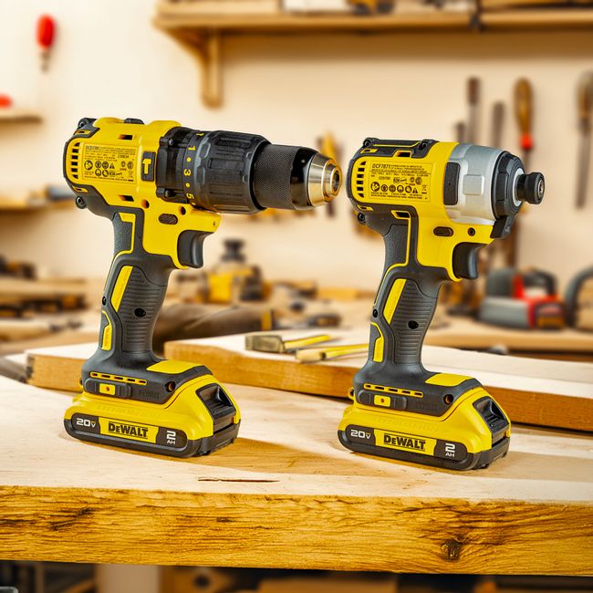
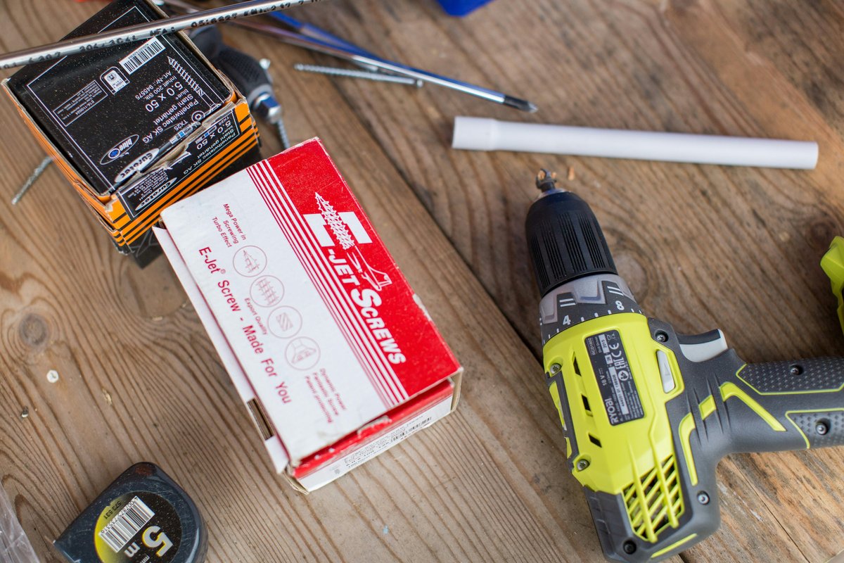
- Tine — a forge-grade trade-supply tile: a molten heat-glow seam (forge-red → white-hot ember-gold → forge-red) under every photo, a squared tempered-iron frame with a forge-steel edge that heats up on hover (ember rim + an outset radiant glow, never a float-lift), an ember brand eyebrow, and a squared forge-steel "Spec verified" capsule that reads the tool's key spec (e.g. "Spec verified · 18V 2.0Ah brushless"). The collection page and
/collectionslanding carry the same thread: the sub-collection chips read as a tempered-iron category switcher (Power Tools / Hand Tools / Fasteners / Safety / Outdoor — the one you're on fills with forge-red under an ember-gold heat-glow underline), a molten heat-glow divider separates the chips from the results, the filter rail uses forge-red checkboxes with an ember-gold price track and forge-red sliders, and the landing mosaic restyles into the same forge look with heat-glow seams under each collection photo. - Neart — a calm, science-led wellness ritual tile: a soft vital-pulse seam (sand-stone → vital-green with a gentle green glow) at the photo→details boundary, a soft-rounded warm-sand slab that settles on hover (a calm vital-green glow that comes to rest, never a float-lift), a Lora serif title, and a soft-rounded pale sand-stone count pill. The collection page and
/collectionslanding carry the same thread: the sub-collection chips read as soft bundle-builder capsules (Sleep / Focus / Calm / Immunity / Morning — the one you're on fills with a solid vital-green pill), a vital-pulse divider (sand-stone → vital-green) separates the chips from the results, the filter rail uses vital-green checkboxes with a vital-green price track between sand-stone sliders, and the landing mosaic restyles into the same calm apothecary look with vital-pulse seams under each collection photo.
The mosaic, the filter and chip blocks, the mobile-columns choice, and the merchant-controlled capsule are shared improvements available to every preset.
Responsive & accessibility
- The card and grid scale to the viewport — the collection grid is a mosaic on desktop and a calm single column on a phone; the cards scale proportionally.
- The capsule clamps to one line on a phone, so it never wraps or overflows the card.
- The metadata capsule label is read out — it's real text, not a decorative pill, so a screen-reader user hears "Turnaround · 8 hrs".
- Filter, sort, and paging changes are announced — a screen-reader user hears the result count after filtering, the sort option by its visible name ("Price, low to high", in their language), and the real page position after loading more ("Page 2 of 4. 24 products shown.").
- Chips keep the shopper's language — on a translated storefront the sub-collection chips (and the empty-state suggestion links) stay inside that language's URLs, and the chip for the page you're on stays highlighted.
- Sea-glass text clears contrast — the eyebrow and accents are tuned to meet WCAG 2.1 AA against the light and dark backgrounds.
- Dark mode pairs automatically — the whole experience reads its colours from the preset tokens plus each section's colour scheme.
- Right-to-left ready — the cards, chips, mosaic, and filter rail flow correctly in Arabic, Hebrew, Persian, and Urdu (built from logical properties).
- Calm, quiet motion — a subtle photo zoom on card hover and a gentle hover nudge on the "View collection" arrow; the arrow nudge is disabled when a visitor asks for reduced motion.
Tips
- Fill the capsule with one decisive detail — a turnaround, a lead time, or an area served reads far better than a generic line. Set the label to match (e.g. "Turnaround").
- Use sub-collection chips to connect related work — Kitchens ↔ Bathrooms ↔ Whole-home keeps a browsing shopper moving between your collections.
- Lead your
/collectionspage with your strongest work — the first collections become the large feature tiles in the mosaic. - Give every collection a strong featured image — the mosaic and the cards are photo-led; a weak or missing image is the one thing that breaks the look.