
Appearance
Featured product
One product, sold properly, anywhere on your store — a homepage, a landing page, an about page.
It is the product page with the gallery taken away: a single photograph beside a column you build yourself from title, price, variant picker, buy buttons and description. A shopper can pick a variant and add to cart without leaving the page they are on.
- You choose what appears, and in what order — the info column is made of blocks you add and drag.
- Four layouts — even, picture-led, words-led, or stacked one above the other.
- It really adds to cart — the same form, the same express checkout buttons, the same sold-out handling as the product page.
Try it
Switch between the four layouts, pick a package to watch the price follow the variant, and use the screen-size and light/dark buttons in the preview header to check a phone and dark mode.
←Featured product
Color scheme
Pins the product info column as the page scrolls. Desktop only.
Shows a persistent quick-view button after the description.
Storefront preview
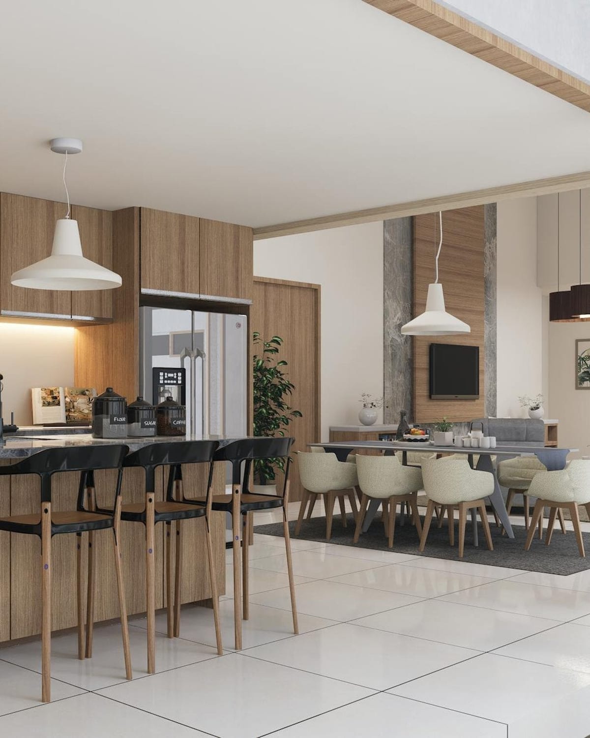
Kitchen design service
Uisce Design Studio
€450.00€550.00Sale
A measured survey, three concept directions and a full set of buildable drawings, delivered by a BIID-registered designer.
Try each Layout — the same blocks, four different weightings of picture against words. Pick a package to see the price follow the variant, exactly as it does on a real product page.
How it works
Add the Featured product section and choose the product in Product. Until you pick one, the image slot shows a "Select a product to display" prompt, so you can place and arrange the section before deciding what goes in it.
Then compose the info column from blocks. A fresh section starts with Title, Price, Variant picker, Selling plan, Buy buttons and Description — a complete buy panel that you can then cut down.
Composition
Media and text (default)                Stacked
┌──────────────┬──────────────┐         ┌─────────────────────────────┐
│              │ Product name │         │                             │
│              │ Vendor       │         │            photo            │
│    photo     │ €450.00      │         │                             │
│              │ [ Package ]  │         ├─────────────────────────────┤
│              │ [ Add to    ]│         │ Product name  €450.00       │
│              │ description  │         │ [ Package ]  [ Add to cart ]│
└──────────────┴──────────────┘         └─────────────────────────────┘
Media dominant widens the photo against the words; Text dominant does the opposite; Stacked puts the photo above a full-width info column. On a phone every layout becomes a single column with the photo on top.
Section settings
| Setting | What it does |
|---|---|
| Product | The product to feature. |
| Color scheme | Paints the whole section — the ink, the option pills, the sale badge and the add-to-cart button. |
| Layout | Media and text, Media dominant, Text dominant, or Stacked. |
| Keep product info visible on scroll | Pins the info column so the buy panel stays on screen while the page scrolls past. Desktop only, and hidden on the Stacked layout. |
| Enable quick view | Adds a persistent quick-view button after the description, opening the full product detail in a dialog. |
The blocks
| Block | What it renders |
|---|---|
| Title | The product title, linked to its own page, with the vendor underneath. |
| Price | The selected variant's price — plus the struck-through compare-at price, a "Sale" badge, and a unit price where the product has one. |
| Variant picker | The option selectors. Colour options render as swatches, six values or fewer as pills, more than six as a dropdown. A product with a single variant renders nothing here. |
| Buy buttons | The add-to-cart button and, optionally, the express checkout buttons. |
| Selling plan | The subscription / delivery-frequency picker. Renders nothing for a product that offers no selling plan, so it is safe to leave in place. |
| Description | The product description — and the quick-view button, when that setting is on. |
| Custom Liquid | Your own markup, anywhere in the column. |
| Purchase reassurance | The delivery / returns / guarantee row also used on the product page. |
| Policy acknowledgement | The tick-box gate also used on the product page, for products that need one before checkout. |
Each block can be added once, except Custom Liquid and Purchase reassurance, which can be added as often as you like.
Buy buttons carries one setting:
| Setting | What it does |
|---|---|
| Show dynamic checkout buttons | Shows the express checkout buttons — Shop Pay, Apple Pay, Google Pay — under the add-to-cart button. On by default. |
Sold out, and preorder
The add-to-cart button mirrors the product's real state. On a sold-out variant it disables itself, relabels to "Sold out", and the express checkout buttons are hidden — because there is nothing to check out. Switching back to an available variant restores all of it. Preorder products keep their preorder label.
App blocks
The section accepts app blocks — reviews, wishlists, size guides — and keeps each one exactly where you drag it among the other blocks, rather than pushing them all to the bottom. App blocks also render while no product is selected, so an app widget never quietly disappears while you are still setting the section up.
Where it can go
Any template's main content. It cannot be placed in the header or footer groups.
Presets
Available in every preset, taking that preset's palette, type and button treatment. It has no per-preset styling of its own.
Responsive & accessibility
- The option pills are a real radio group —
role="radiogroup"witharia-checkedon each pill, each carrying its option name in its label ("Package: Full design"), so a screen-reader user hears what they are choosing between. - Comfortable targets. The option pills are 44 × 44px and the add-to-cart button is 52px tall; the quick-view button is 40px, which clears the WCAG AA target-size floor with room to spare.
- The buy button's state is real, not painted. On a sold-out variant it is genuinely
disabledand its label changes to "Sold out", so assistive technology reports both the state and the reason. - The title link is the product's own page, so a keyboard user can always get to the full detail.
- The sale badge is a word, not just a colour, and its ink is the scheme's on-brand foreground pair rather than a fixed value.
- One colour scheme paints the section, so the ink and the controls can never land in a low-contrast combination.
When it isn't showing
The section renders either way. With no product chosen the theme editor shows "Select a product to display" in place.
A product that is entirely sold out still renders — you get its unavailable state rather than the buy buttons, which is deliberate.
Tips
- Use it for the one product you would name if someone asked — a flagship, a bundle, a service. It loses its point with a whole catalogue.
- Cut the column down. Title, price and buy buttons are often enough on a homepage; the description belongs on the product page.
- Keep product info visible on scroll earns its keep with a long description and not much else. On a short column it does nothing visible.
- If the featured product has no image, the theme editor shows a placeholder while your storefront simply leaves the slot empty — but a product worth featuring is a product worth photographing.
Related sections
- Product page — the full page, with the media gallery.
- Featured collection — several products rather than one.
- Sticky add-to-cart — keeps the buy action in reach on the product page itself.