
Kitchen design
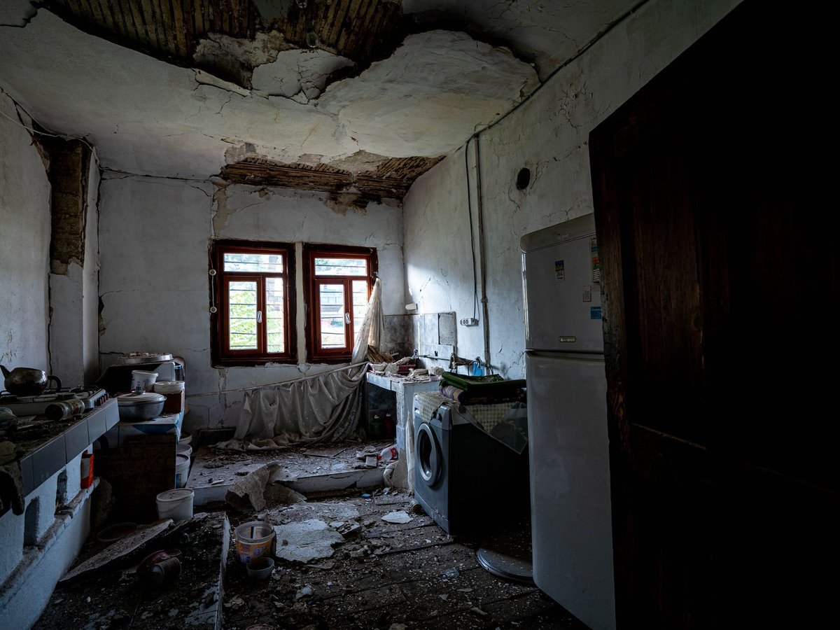
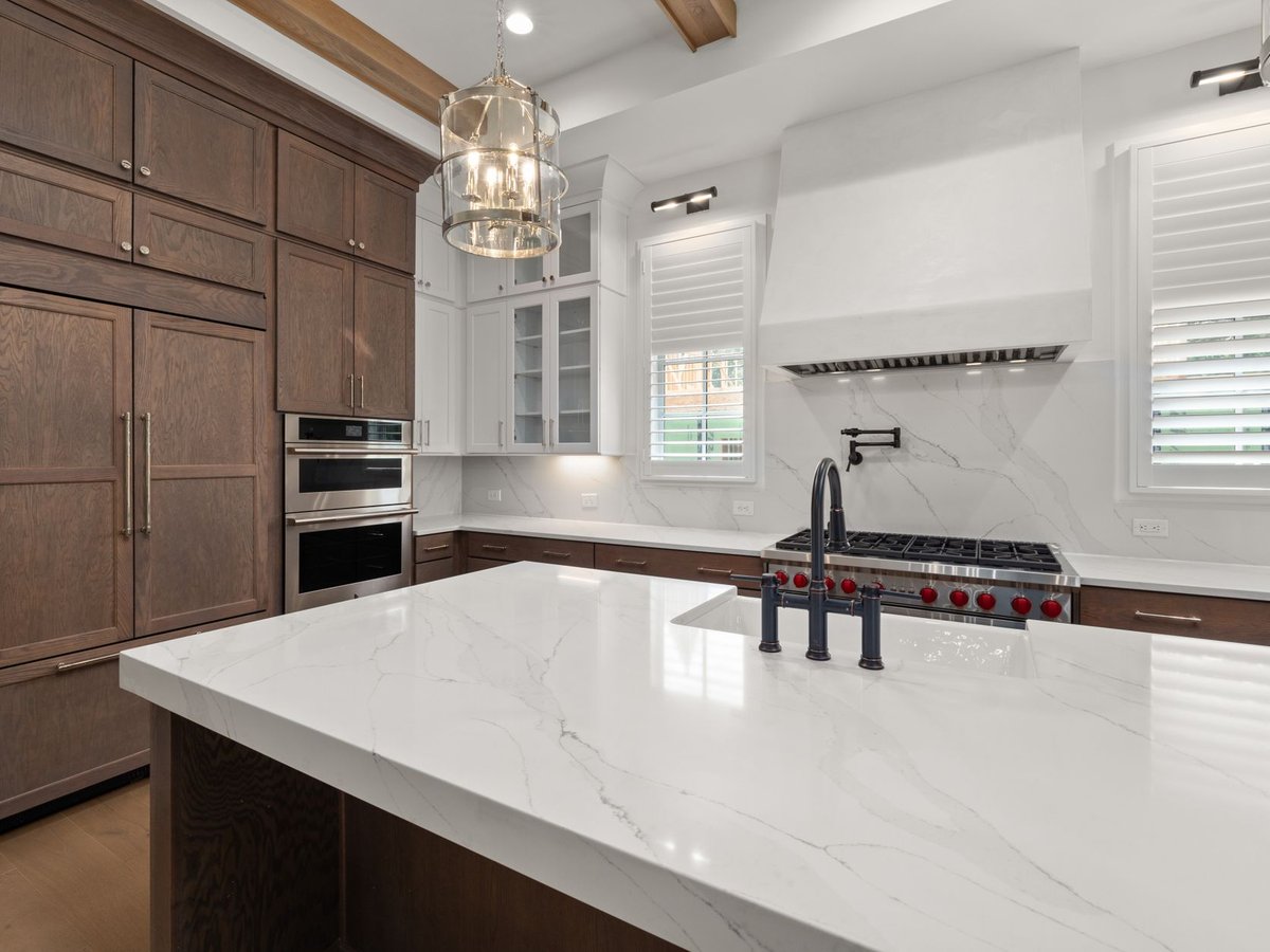
Georgian townhouse — full kitchen redesign
Listed-building approval coordinated with the conservation officer. Hand-painted cabinetry and a marble-topped island restored the room as the home’s social heart.
View case studyAppearance
A gallery of your finished work — each project shown as a before and after pair, so the change speaks for itself.
Visitors can filter by category using the row of tabs above the grid. The first project runs full width, like the opening spread of a magazine.
Six projects, each shown as it was found and as it was handed over.
6 case studies
Listed-building approval coordinated with the conservation officer. Hand-painted cabinetry and a marble-topped island restored the room as the home’s social heart.
View case study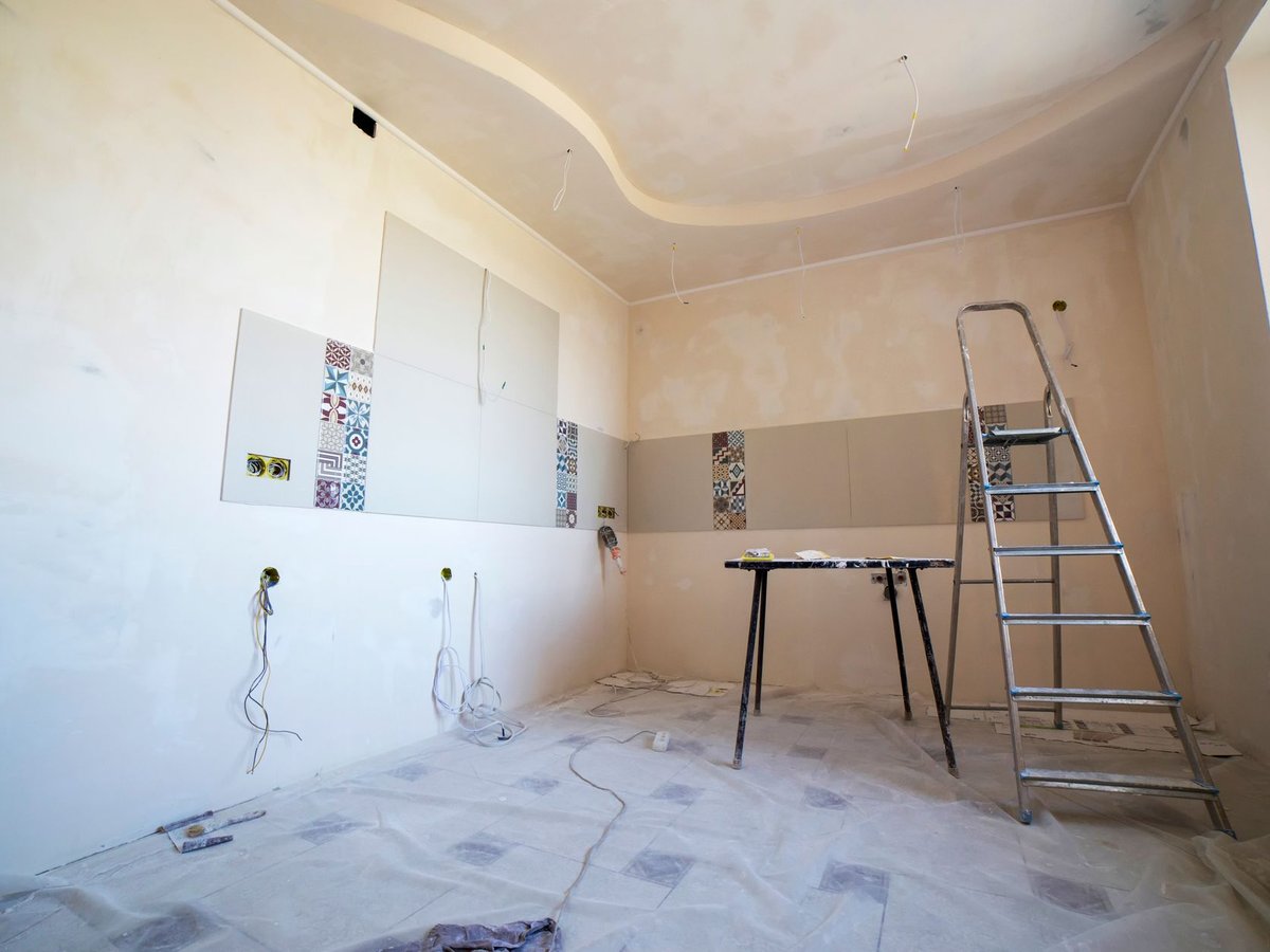
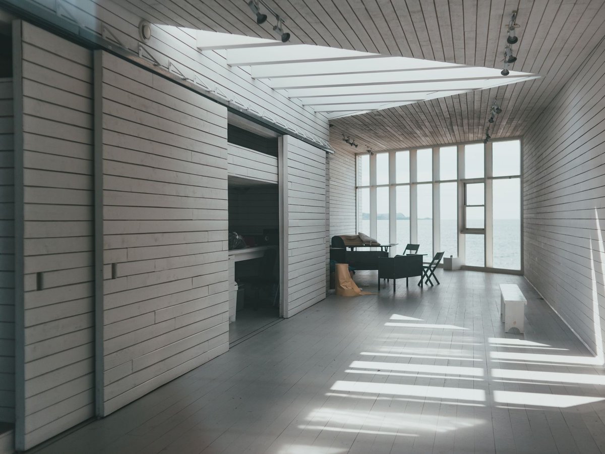
Full furniture specification for a 4-bedroom new-build overlooking Howth, tuned to the Atlantic light.
View case study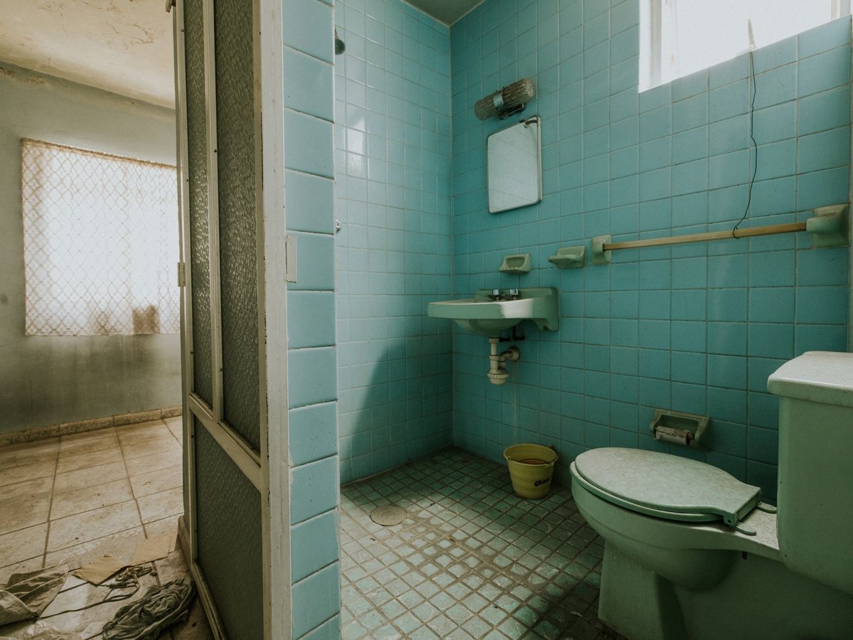
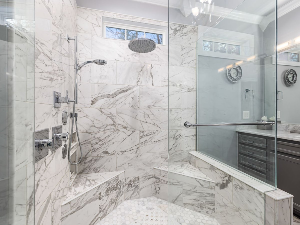
Eight identical en-suites in four weeks. Phased works kept the hotel trading throughout.
View case study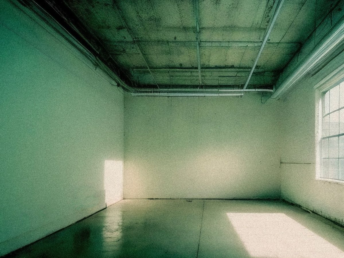
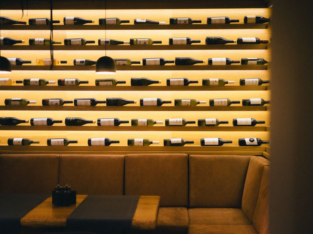
A 60-cover Galway city-centre restaurant, built overnight in three sprints so it never closed.
View case study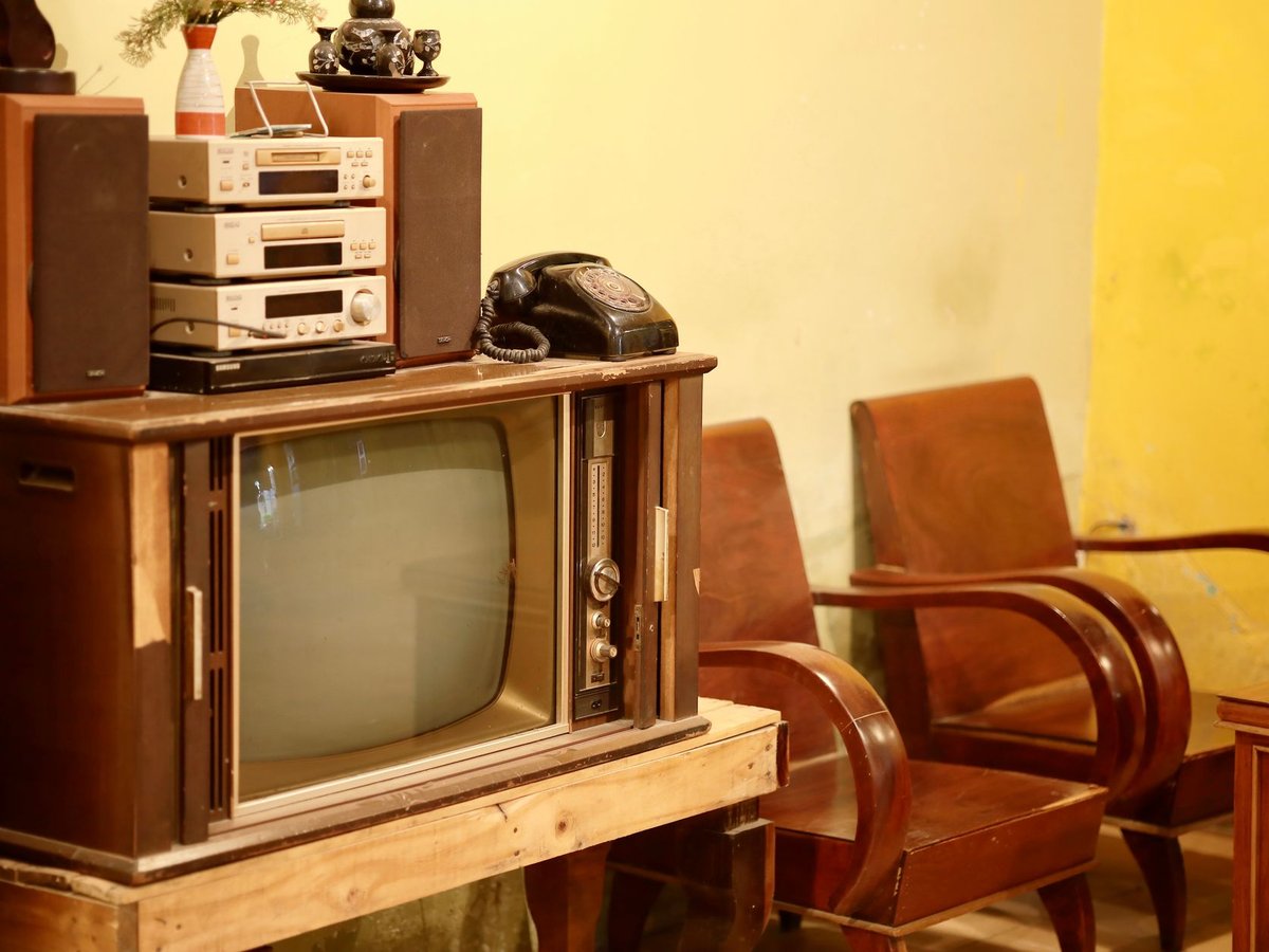
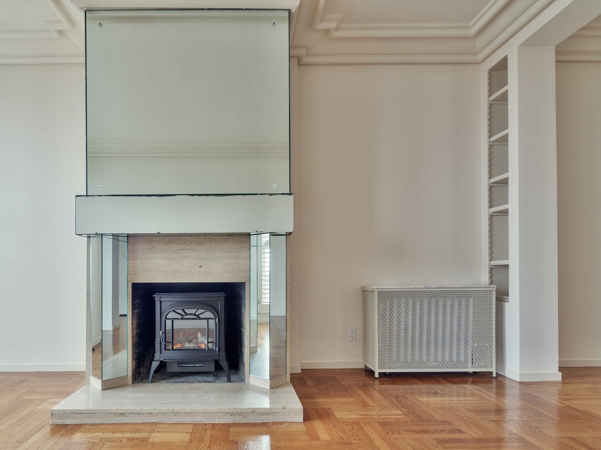
A 1930s semi-d in Salthill: kitchen, two bathrooms and an attic conversion across nine trades.
View case study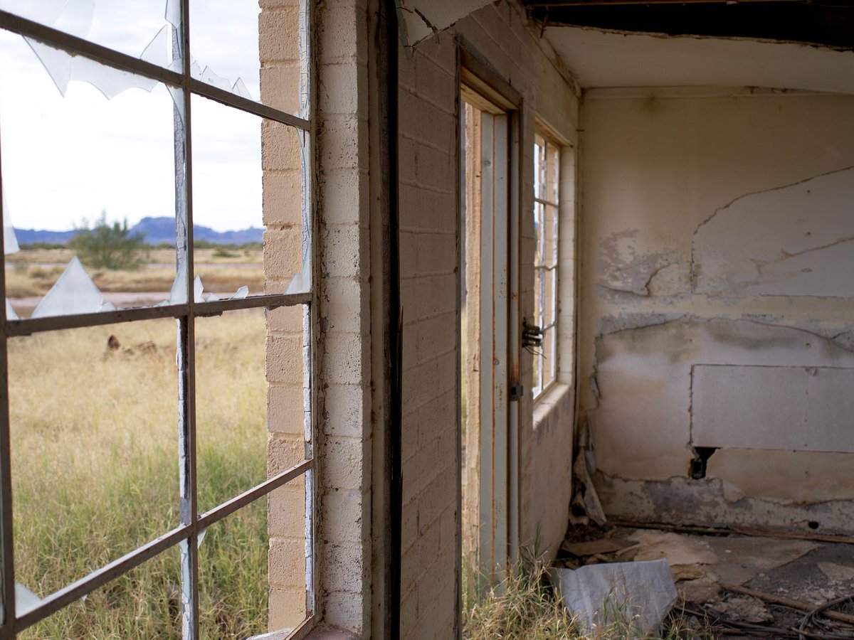
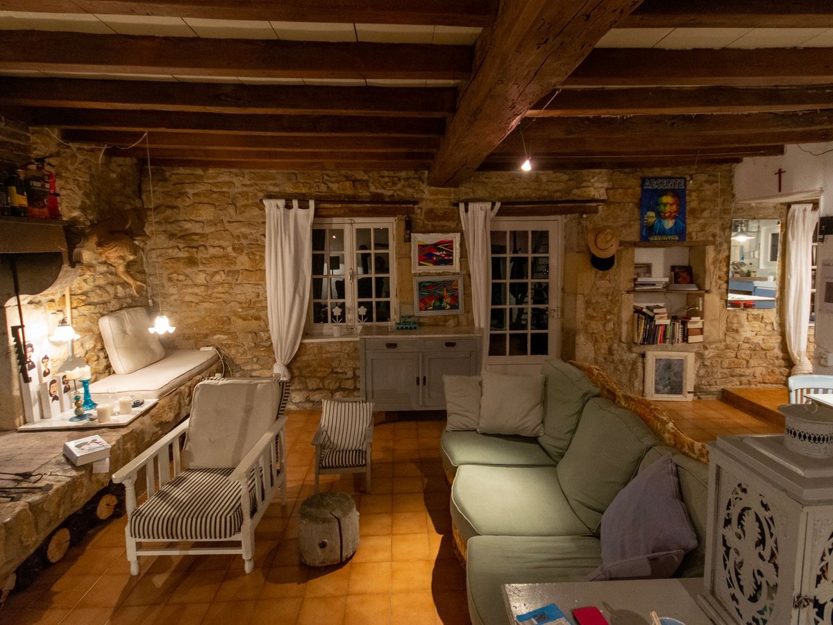
An 1830s West Cork stone farmhouse restored with lime mortar and reclaimed pitch-pine flooring.
View case studyClick a category tab — that's the shipped filter running, not a mock. Edit the first case study's Category to watch it move between tabs.
Each project is a case study block: two photos, a category, a title, a short excerpt, and a link.
The two photos sit flush together as one picture, labelled BEFORE and AFTER. That pairing is the whole point — a single "after" shot tells a visitor nothing about what you changed.
Desktop                             Phone
┌───────────────────────────────┐   ┌──────────────┐
│  BEFORE  │  AFTER   (wide)    │   │ BEFORE│AFTER │
│  Title, excerpt, link         │   │ Title…       │
├───────────────┬───────────────┤   ├──────────────┤
│ BEFORE│AFTER  │ BEFORE│AFTER  │   │ BEFORE│AFTER │
├───────────────┴───────────────┤   │ Title…       │
│  BEFORE  │  AFTER   (wide)    │   └──────────────┘
└───────────────────────────────┘
The first project always runs full width. If you have an even number of projects, the last one runs full width too, so you never end up with a lone card stranded in a half-empty row.
On a phone the pair stays side by side rather than stacking — the transformation has to be readable in one glance.
This is the setting to get right. The Category you type on each case study is what builds the row of filter tabs. Type it the same way every time.
Spellings that differ only in capitalisation or spacing are merged: Kitchen design and Kitchen Design produce one tab, and the first spelling you used becomes the tab's label. Genuinely different names — Kitchens and Bathrooms — each get their own tab.
Leave every category blank and the filter row disappears, which is fine if you only have a few projects.
| Setting | What it does |
|---|---|
| Color scheme | Colors the whole section. |
| Heading | The title above the grid, e.g. "Selected work". |
| Subheading | One line under the heading. |
| Related article | Optional. Links a blog post under the heading; the link hides itself if the post doesn't exist. |
| Setting | What it does |
|---|---|
| Title | The project name, e.g. "Georgian townhouse — full kitchen redesign". |
| Category | Builds the filter tabs. Spell it identically across projects (see above). |
| Excerpt | Two or three lines on what you actually did. Say the constraint you solved. |
| Before image | The room as you found it. |
| After image | The same room, finished. Shoot it from a similar angle — the pair should read as one. |
| Case study URL | Where "View case study" points. Leave blank and the link is hidden. |
Photos are cropped to 4:3 and lazy-loaded below the fold.