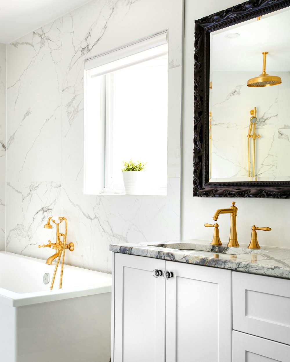
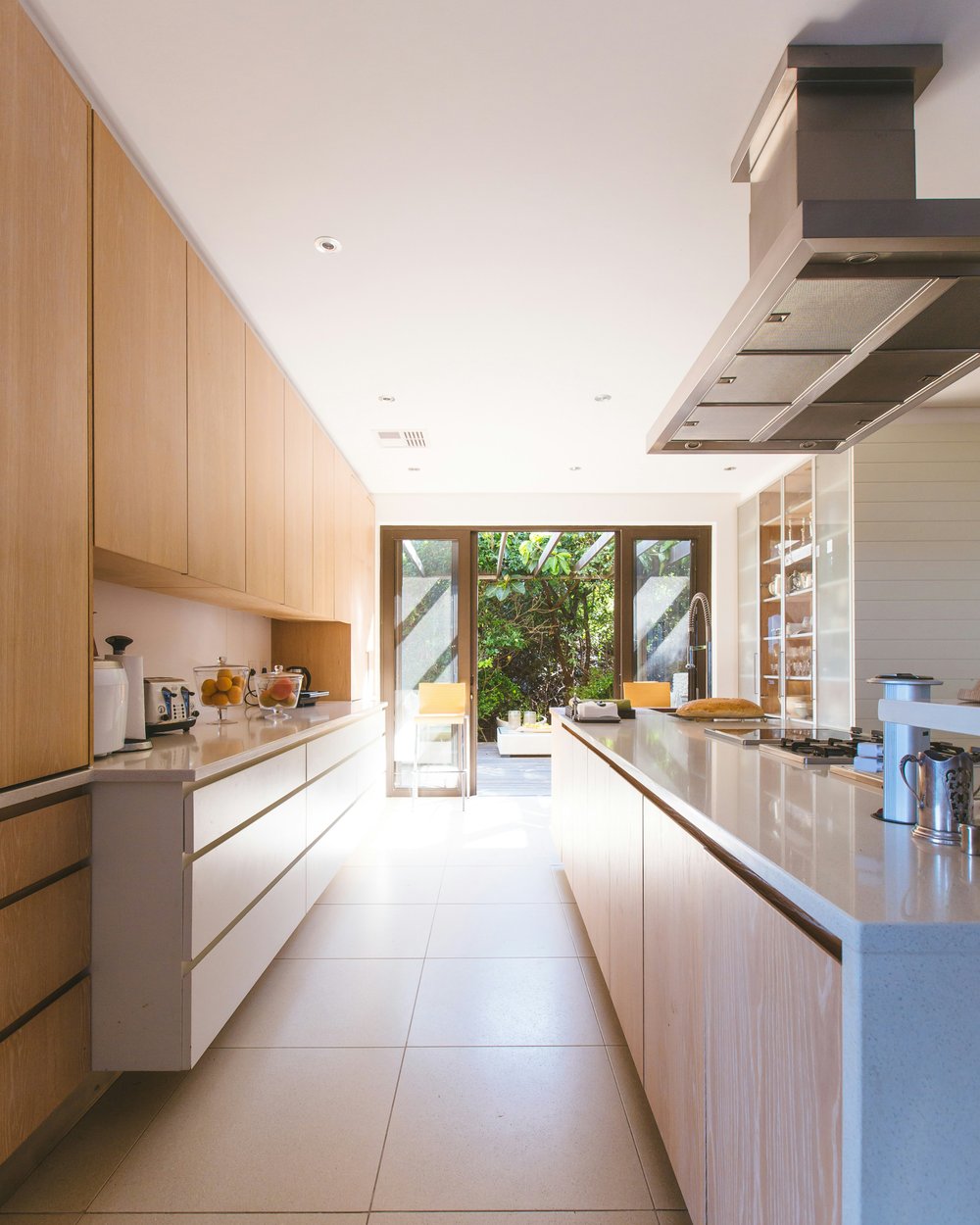
Kitchen design
Complete kitchen redesign from concept to completion — cabinetry, worktops, island placement and appliance integration.
- Initial consultation
- Floor plan & 3D renders
- Material sourcing
- Project management
Appearance
What you do, and what it costs — as a band of cards that runs the full width of the page.
Each card is one thing you sell: a photo (or an icon), a title, a short description, a ticked list of what's included, then the price and how long it takes, and a button into booking it. One card can be flagged Most popular.
It is the signature opening section of the Uisce (services) preset, and it works for any store that sells work rather than objects: a studio, a trade, a clinic, a consultancy.
Edit the first card, switch the colour scheme, drop to two columns, and use the screen-size and light/dark buttons in the preview header to check a phone and dark mode.
Short kicker text rendered above the heading in smaller, uppercase type.
One inclusion per line
Shown as a small label on the highlighted card. Defaults to "Most popular".
BIID-registered practice. Site-specific design from concept to final walkthrough.
Complete kitchen redesign from concept to completion — cabinetry, worktops, island placement and appliance integration.

Wet room, en-suite or family bathroom — every trade managed from first fix through final tiling, with site supervision.

Mood boards, furniture specification and a half-day styling session that transforms a room without a building warrant.
The first card has no photo, so its Icon picker is live — pick a mark and watch the chip change. The other two carry photos, which is what replaces the chip on a real store.
Add the Service packages section, then add a Service block for each thing you sell — up to six. A fresh section starts with three example services so you are editing a band, not staring at an empty one.
Each block is one card. Every field is optional and each part renders only when you fill it in: a service with no price shows no price cell, one with no button shows no button, and one with neither shows neither. Nothing reserves an empty slot.
[ EYEBROW ]
Section heading
Subheading
┌───────────────┬───────────────┬───────────────┐ ← 1px waterline gutter
│ ▔▔▔▔▔▔▔▔▔▔▔▔▔ │ ▔▔▔▔▔▔▔▔▔▔▔▔▔ │ ▔▔▔▔▔▔▔▔▔▔▔▔▔ │ ← 4px sea-glass rule
│ │ │ │ on EVERY card
│ photo │ photo │ photo │
│ 4:5 │ 4:5 │ 4:5 │
│ │ │ │
│ MOST POPULAR │ │ │
│ Service title │ Service title │ Service title │
│ description │ description │ description │
│ ✓ inclusion │ ✓ inclusion │ ✓ inclusion │
│ │ │ │
│ PRICE │ DURN │ PRICE │ DURN │ PRICE │ DURN │ ← foot pinned to the
│ [ Book it → ] │ [ Book it → ] │ [ Book it → ] │ bottom of the card
└───────────────┴───────────────┴───────────────┘The header — eyebrow, heading, subheading — sits in the page container so the copy keeps a comfortable measure while the cards below run edge to edge. Leave all three blank and the header disappears.
Every card carries the same 4px sea-glass rule across its top, so the three read as one set. The highlighted card is marked only by its small uppercase flag, never by a different border.
A card with an Image is image-forward: a 4:5 upright photo above the text, very slightly desaturated, which comes back to full colour and lifts a little on hover.
A card with no image shows a round Icon chip instead — that is why the Icon picker only appears while the image slot is empty. Both treatments are shipped and both look deliberate; what looks unfinished is mixing them at random. Either photograph every service or icon every service.
| Setting | What it does |
|---|---|
| Color scheme | Paints the whole band from one scheme — the sea-glass top rule, the inclusion ticks, the flag and the button all derive from it. |
| Eyebrow | A short kicker above the heading, in small uppercase type (e.g. "OUR SERVICES"). Optional; defaults to "Our Services". |
| Heading | The section title. Defaults to "Our services". |
| Subheading | One centred line under the heading. Optional. |
| Columns | Two or three cards per row. With fewer services than columns the grid narrows to match, so two services never leave an empty slot. |
| Setting | What it does |
|---|---|
| Heading | The card title — the name of the service. |
| Text | Two or three lines describing what the service is. |
| Inclusions | What the package includes, one per line. Each line becomes a ticked list item. |
| Price text | Free text, shown under a small "Price" caption — "From €4,500", "€90 / hour", "Quoted per project". |
| Turnaround time | Free text, shown under a small "Duration" caption — "6–8 weeks", "Same day". |
| Button label | The call-to-action text. The button appears only when the label and the link are both filled in. |
| Button link | Where the button goes — a booking product, a contact page, an enquiry form. |
| Image | A portrait card photo. Crops to 4:5 from the middle, so keep the subject central. |
| Icon | The mark shown in a chip when there is no image: Briefcase, Wrench, Paintbrush, Home, Star, Clock, or None. Hidden once you add an image. |
| Highlight this service | Marks the card with a small uppercase flag. Set it on one card only. |
| Highlight label | Replaces the flag's text. Defaults to "Most popular". Only appears once the card is highlighted. |
The section renders a stable #service-packages anchor, so a hero button or a menu item can point straight at it — /#service-packages on the homepage — however the rest of the page is arranged. The anchor clears the sticky header on its own.
App blocks are supported and render below the card grid. They never count towards the column clamp, so a two-service section with an app block is still a two-column band.
The section is available in every preset and it carries no per-preset styling of its own — every treatment is derived from the colour scheme, so the band takes on whichever preset's palette and type the store is running. The full-bleed service band is the Uisce identity because that is the preset built around selling services; in the others the same section reads in that preset's colours.