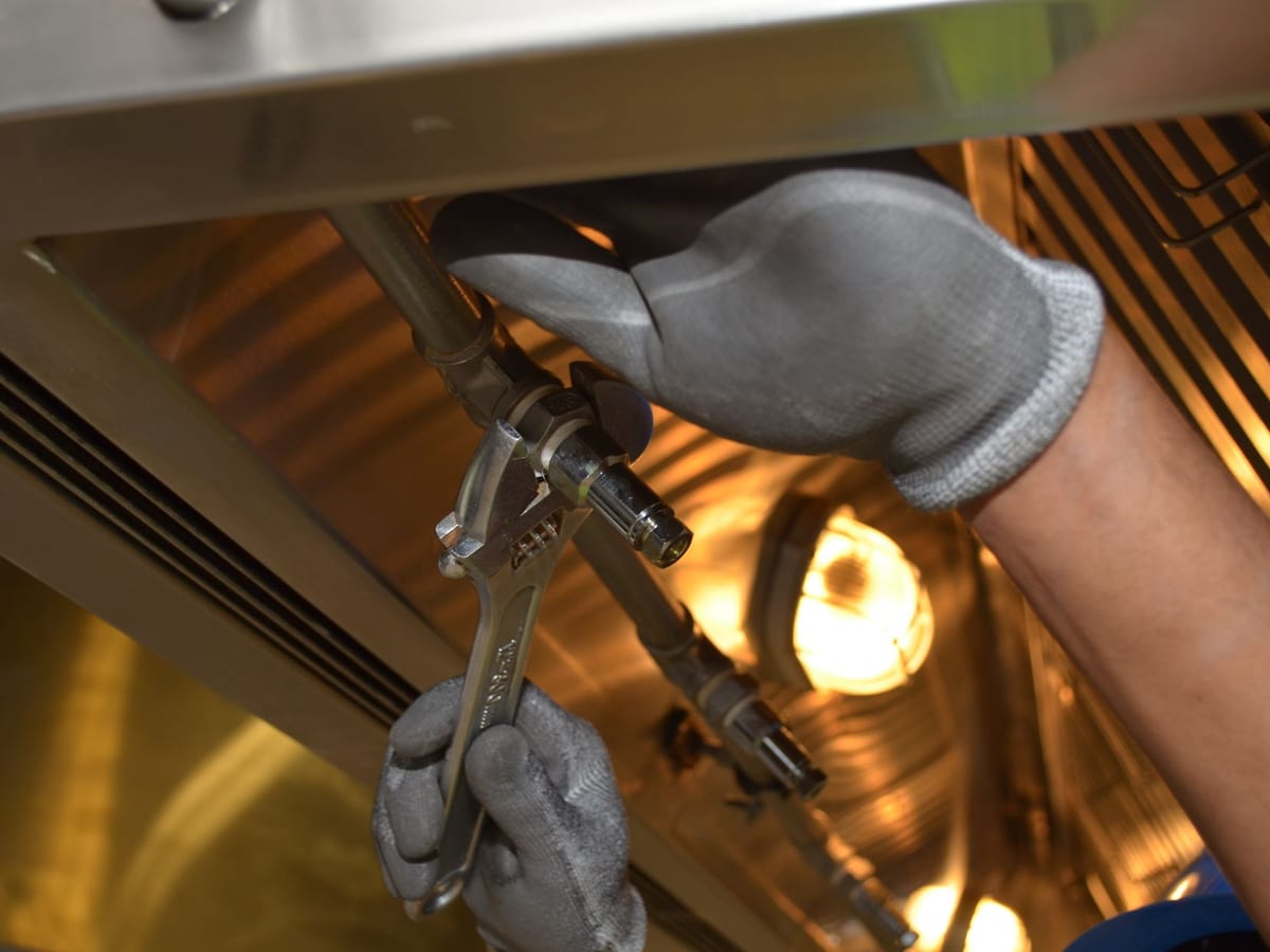
Kitchen Repairs , Beginner project
Taps, pipes, sealants, and fixings for kitchen maintenance.
A bold, industrial design for hardware stores, tools, and equipment brands.
Hardware stores, power tool brands, automotive parts, construction supplies, workwear, and industrial equipment. If your customers build things, fix things, or get their hands dirty, Tine is your preset.
Red and dark gray with yellow accents. High-contrast and utilitarian — it says durability and no-nonsense quality. The condensed heading font adds a rugged, mechanical character. This is not a delicate design. It's built to sell tools.
| Role | Font | Weight |
|---|---|---|
| Headings | Oswald | Bold (700) |
| Body | Roboto | Regular (400) |
Oswald is a condensed sans-serif with a strong, mechanical feel. Roboto is clean and highly readable — great for product descriptions and spec sheets.
These sections are a natural fit for Tine's bold, industrial look:
The Tine homepage opens on a full-height coverflow slideshow and hands straight over to Shop by Project: a trade-grade job board that organises browsing by the job, not the product category. Every lane is a job-spec card — a real project photo, a one-line scope, and a forged difficulty gauge that reads at a glance: one lit rung for Beginner, two for Intermediate, three for Advanced. A DIY shopper scans it like a blueprint pinned to the workshop wall and knows in a second which jobs are their level and what they'd be taking on.
It's unmistakably the forge preset — squared tempered-iron cards, a warm offset shadow, and a gauge that ignites from ember-gold to forge-red — and unmistakably more than a recoloured image grid. The difficulty gauge is the thing that sets it apart from a plain category grid: it turns how advanced is this? into one glance, and speaks the level to screen readers so the meaning never depends on seeing the meter.
Try the live section below. The default is the Tine forge treatment with the real DIY job board; switch presets to see the same shared section take each preset's colours and type, switch to a phone, and toggle dark mode (the card surface and gauge re-tone with the scheme).
The same section ships in every preset and works for any catalogue where how advanced something is matters — online courses by skill level, recipes by difficulty, fitness programs by intensity, craft kits by experience. Set every card's level to None and it's a clean plain category grid. Full settings, accessibility, and per-preset notes are on the Shop by level component page.
Built for large catalogs (200+ products). The utilitarian design scales well with big product ranges and deep category trees.

Celtic for "fire" — Tine is the sharp, industrial hardware-niche preset for Shopify merchants selling tools, fasteners, power tools, hand tools, and building supplies. The industrial-grid visual signature (CSS grid-line pattern and sharp corner border-radius on niche sections) signals precision and authority — ideal for hardware resellers and trade suppliers competing against specialist distributors on Shopify.
Tine serves merchants who:
Hardware resellers and tool distributors: 100–5,000+ SKUs, mix of trade and retail customers, strong repeat purchase on consumables (fixings, blades, abrasives), high-value single purchases on power tools. Technical specification accuracy is a trust signal.
Note on scope: Tine's niche features go where hardware shoppers already are. The comparison table ships on the homepage and drops onto any page, collection, or product template; specs-table mode belongs on product pages; quick order has its own Trade order page template. Hardware merchants are product-rich rather than content-page-rich, so Tine's merchant guide is naturally somewhat shorter than the other presets — that is expected and deliberate, not a gap.
The Tine preset loads assets/preset-tine.css when settings.preset is tine. This CSS:
.preset-tine .niche-anchor)The header (a shared component across all presets) wears Tine's fire/forge signature, loaded from assets/tine-visual.css. The palette is forge red, ember gold, and anvil charcoal/steel — not generic SaaS orange:
backdrop-filter: blur(16px)), high-contrast and industrial. On the homepage hero it carries a forge-charcoal scrim; on scroll it settles to solid tempered-iron with a soft forge-red-toned shadow.#dc2626 → #eab308 → #dc2626), wrapped in a soft red heat-bloom. It ignites from the centre and runs to both ends (scaleX, transform-origin: center) like a strip of metal heating to temperature.The signature is decoration only — colour, border, blur, and the underline animation. It adds no menus; your navigation comes from your Shopify menu. It is right-to-left safe (the heat-glow ignites from the centre, so it needs no direction flip) and reduced-motion safe (the heat-glow appears instantly when reduced motion is requested). See the Header guide for the live demo.
sections/comparison-table.liquid) A column-based feature-comparison table for comparing products side by side — designed for hardware buyers making "which fastener/tool is right for my job" decisions.
aria-sort updated; screen reader announces sort direction)orientation: rows): the comparison table doubles as a specs table — each block is one attribute and its value for a single productaria-sort on sortable column headers; the sort control is a real button, so it tabs and activates like one; a live region announces the new sort state| Setting | Type | Default | Description |
|---|---|---|---|
color_scheme | color_scheme | — | Section background |
orientation | select | columns | columns (product comparison) or rows (specs table / attribute listing) |
heading | text | — | Section heading |
feature_header | text | Feature | Heading for the first column, the one that names each row. Columns mode only |
enable_sortable | checkbox | false | Adds sort buttons to the column headers. Columns mode only |
related_article_handle | article | — | Optional blog post to link from the section. Hidden if the post is unpublished |
Where to find it in the theme editor: Sections → Comparison table → Section settings tab.
Product comparison mode (orientation: columns): Use this to compare 2–5 products or models side by side. Each column block defines a product column with a header and up to 10 specification rows.
Specs table mode (orientation: rows): Use this to list all specifications of a single product in a two-column table (attribute + value). This is the preferred pattern for hardware PDPs where a product has 15+ technical attributes. Add a Comparison Table section to your product page template and set orientation: rows.
comparison-table.liquid with orientation: rows) The specs-table mode is the same section as the comparison table but configured for single-product technical data presentation — more compact, not sortable, focused on attribute + value pairs.
Add the comparison-table section to your Tine product template with orientation: rows to display:
Important on standards references: Use current standard names. ASTM A325 was withdrawn and replaced by ASTM F3125/F3125M. Use F3125 / F3125M in any spec row referencing that standard. Add a "Replaces" row if you sell to customers who still search by legacy names.
Metric/imperial note: The uisce_tine.dimensions_mm metafield stores metric dimensions. If your customers expect imperial (e.g., US/Canadian trade), add a companion uisce_tine.dimensions_in metafield and surface both via separate spec rows or a toggle note.
sections/quick-order.liquid) The quick-order section includes a bulk-pricing messaging mechanism: when a row's quantity reaches the minimum you set, a savings badge appears highlighting the bulk saving percentage.
bulk_threshold, a badge appears: "Save {bulk_save_percent}%" (a polite live region announces the saving so screen reader users hear it; the badge itself is hidden from them, so it is spoken once). Both bulk_threshold and bulk_save_percent must be above zero — a badge reading "Save 0%" is never rendered| Setting | Type | Default | Description |
|---|---|---|---|
color_scheme | color_scheme | — | Section background |
heading | text | Quick Order | Section heading |
collection | collection | — | The collection to list. Until you pick one the section renders nothing on the storefront (a setup prompt shows in the theme editor) |
bulk_threshold | number | 0 | "Minimum quantity" — the quantity at which the savings badge appears. 0 hides the badge entirely |
bulk_save_percent | number | 0 | "Savings percent" — the percentage shown on the badge (informational only). 0 also hides the badge |
related_article_handle | article | — | Optional blog post to link from the section. Hidden if the post is unpublished |
Where to find it in the theme editor: Sections → Quick order → Section settings tab.
The theme's savings badge is a display message. To apply actual tiered discounts:
bulk_threshold and bulk_save_percent in the Quick Order section to match your actual first pricing tier.The Tine preset extends snippets/json-ld.liquid to emit Product JSON-LD with additionalProperty entries for technical specifications. Three metafields feed it — weight_grams, dimensions_mm, and material. Each one you populate adds a PropertyValue entry named after the metafield key:
{
  "@type": "PropertyValue",
  "name": "material",
  "value": "Stainless steel A2"
}
This allows Google Shopping to surface richer product data for hardware queries. The schema activates when any of uisce_tine.weight_grams, uisce_tine.dimensions_mm, or uisce_tine.material is populated.
To validate, paste a product URL into Google's Rich Results Test.
Standards reference note: Keep standards names current. Use ASTM F3125/F3125M not the withdrawn ASTM A325. Use ISO 898-1 for carbon/alloy steel bolts. The provisioner seeds examples with current standard names.
The comparison table does not emit structured data (no schema.org type for comparison tables). If you want to expose your comparison data in Google's Knowledge Panel, consider adding a DataCatalog or Table entity via a custom JSON-LD block — this is outside the theme scope but can be added via an HTML block on your comparison page.
The Tine preset does not ship dedicated TDS/SDS (Technical/Safety Data Sheet) sections. Hardware merchants who need to surface compliance documents should use one of these approaches:
File metafields: Use the file_reference metafield type in Shopify Admin to attach PDF documents (TDS, SDS, declaration of conformity) to products, then link them from the product description or an app block.
Metafield + custom block: Add a downloads block to your product template with a repeating link list (file URLs entered manually in block settings). This is a Shopify app-block pattern — no theme code changes required.
REACH/SVHC notice: For products subject to REACH Article 33 (SVHCs >0.1% w/w), add a dedicated "Compliance" tab to your product page with the SDS + SVHC notice. Use a richtext block in the product description tabs section for this content.
Tine niche sections and PDP blocks read the uisce_tine namespace (fixed). Key metafields:
| Key | Type | Used by |
|---|---|---|
weight_grams | number_integer | specs-table-row PDP block; Product JSON-LD |
dimensions_mm | single_line_text_field | specs-table-row PDP block; Product JSON-LD |
material | single_line_text_field | specs-table-row PDP block; Product JSON-LD |
wattage | single_line_text_field | specs-table-row PDP block (power tools) |
size | single_line_text_field | specs-table-row PDP block |
power_source | single_line_text_field | specs-table-row PDP block |
battery_compat | single_line_text_field | cross-reference PDP block |
Two blocks are available in the Tine product template (listings/tine/templates/product.json):
| Block handle | Description |
|---|---|
specs-table-row | Renders a compact specs row table from uisce_tine.* metafields on the PDP |
cross-reference | Lists the battery platforms a product works with, from uisce_tine.battery_compat (one line per /-separated entry) |
The scripts/populate-niche-tine.mjs provisioner creates:
uisce_tine.* metafield definitionsuisce_tine.* metafields pre-populated (sourced from ASTM/ISO/DIN representative values), published to the Online Store channelIt creates no collections and no pages, configures no sections, and leaves your footer alone — you compose the comparison table and the trade-order page yourself.
node scripts/populate-niche-tine.mjsStore credentials come from .env.stores; the script picks the Tine store itself. Add --dry-run to see what it would do without writing anything.
orientation: rows.uisce_tine.* metafield definitions yourself and fill them in on your products.bulk_threshold, and bulk_save_percent.For Tine, the niche features (comparison table, specs table, bulk pricing display) are product-rich and require no app integration at the surface level. For advanced capability:
| Category | Recommendation |
|---|---|
| Real tiered/quantity discounts | Shopify volume discounts, a Shopify Functions discount app, Bold Quantity Breaks, or Hulk Volume Discounts |
| TDS/SDS document delivery | Cloudflare Pages function (already in project stack) or a file-reference metafield block. No first-party Shopify app recommendation. |
| Trade account pricing | BSS B2B/Wholesale Solution or Locksmith; note B2B features are a v1.1 deferral. |
The savings badge appears when a line's quantity reaches bulk_threshold (and bulk_save_percent is above zero). It does not apply a Shopify discount automatically. Customers must add the items to cart and the actual price they pay depends on your Shopify discount configuration. Make sure the threshold and percentage you set in section settings match your actual pricing tiers, or customers will be misled.
Sorting takes the first number it finds in each cell and orders by that, falling back to alphabetical order when a cell has no number or two cells share the same one. Simple metric sizes therefore sort the way you expect: M8, M10, M12, and 5,5 mm (European decimal commas are handled).
Two value shapes sort by that first number rather than by meaning. Fractional imperial sizes all read as their numerator, so 1/4-20 and 1/2-13 both count as 1 and fall back to alphabetical order — 1/2-13 lands before 1/4-20. Standards codes such as ASTM A307 and ASTM F3125 sort on their embedded digits rather than as whole codes. If a column holds values like those, leave sorting off for the table and list the rows in the order you want them read.
When orientation: rows, the sort controls are hidden — a specs table is not sortable by design (it has only one product's values; sorting attribute names is not meaningful).
The preset-tine.css grid-line pattern applies to niche-anchor sections while the Tine preset is active (.preset-tine .niche-anchor). The signature is subtle — a 24×24px grid of 1px lines at low opacity, drawn from your scheme's foreground colour so it re-tones in dark schemes. It does not interfere with text legibility, and it carries Tine's visual differentiation for Theme Store review, so leave it in place.
The comparison table implements WCAG 2.1 AA sortable table pattern:
aria-sort on each <th> heading button: "none", "ascending", "descending"<button> elements inside <th> — not <th> elements acting as buttons<button>, so it sits in the normal tab order and both Enter and Space activate itThe quick-order section renders product rows with:
<input type="number" min="1"> quantity fields, each carrying an aria-label so the column meaning survives without a visible label<select> per multi-variant product, also labelled by aria-labelaria-live="polite" region per row — it announces "Save 10% on this quantity" the moment a quantity crosses the minimum, while the visual badge itself stays aria-hidden so the message is not read twiceThe Tine preset uses logical CSS properties:
padding-inline on the table container; text-align: start on feature labels and spec valuestext-align: start on every table cell; margin-inline-start on the savings badge, so it sits after the quantity field in both directionsuisce_tine.material and uisce_tine.dimensions_mm populatedbulk_threshold and bulk_save_percent reflect actual pricing tierssettings.preset is set to tine in Theme settingsThe Tine preset emits Product JSON-LD with additionalProperty entries for technical specifications. To validate:
curl -s "https://your-store.myshopify.com/products/tine-cap-screw-m8-50-a2" \
  | grep -A 20 '"additionalProperty"'